

How to Use Campogos to Unify Campaigns
By Kiana Denlinger | August 18, 2015
If you don’t know what a campogo is, don’t be alarmed – it’s a portmanteau I made up to describe a campaign logo, or the visual identifier that represents a particular campaign.![]()
Each brand relies on a set of icons made up of words, shapes and letterforms to tell its story. That set of icons always includes a logo, but sometimes it also includes sub-brands and campogos. Using a logo is pretty straightforward, but knowing how – and when – to use a campogo can be downright confusing!
Since a campaign is a series of elements designed and disseminated to bring about a particular result, it’s crucial to visually link those elements. Campogos can certainly do that, but to determine if you really need one you should consider what kind of campaign you’re running and the goals you hope to achieve.
To get you on the track to successful campaigning, I’ll define the types of iconography you have at your disposal then detail a few well-executed campaigns that use campogos effectively. I hope that exploring the application of campogos will help you understand how you might use them successfully in your own marketing.
Sign Up for Pegable Post to get ideas, advice and resources on activating your Purpose sent right to your inbox.
Your Toolbox
As illustrated below, brand icons can be divided into three categories: logos, sub-brands and campogos.
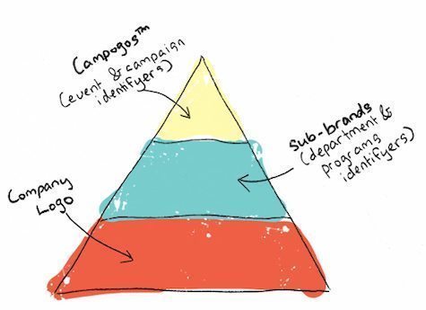 Logos, at the bottom, are the visual foundation of the brand. A logo is a symbol that represents the essence and personality of the brand itself.
- Sub-brands, nestled in the middle, represent and distinguish various departments, programs, products or other systematic endeavors within a larger organization.
- Topping off our triangle of brand iconography are campogos: campaign-based symbols that communicate a specific concept or ask. Keep in mind that campogos are fluid and seasonal in that they can be retired at the end of a campaign. They function as the “boots on the ground” of branding. They are used most successfully when campaigns have an action-based ask and need cohesion between multiple channels (digital, social, print, outdoor) and materials (advertisements, website, events).
Using Campogos
Be Cruelty-Free
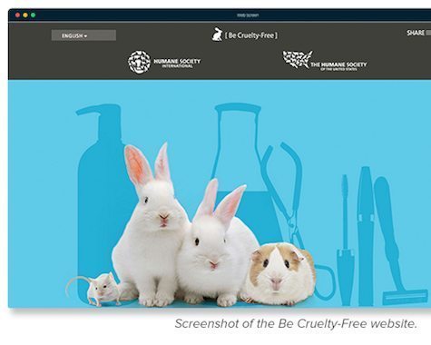 What is it? The Be Cruelty-Free campaign by the Human Society International (HSI) made headlines from the borders of South Korea and Taiwan to Brazil and Portugal. It encouraged people all over the world to lobby their local legislators for a ban on cosmetics testing on animals. The visibility of the campaign can be attributed to hard work, location-specific marketing materials, HSI authority and expert use of a single, strategic and highly recognizable campogo.
How do they use the campogo? From a visual perspective, anyone can look at the Be Cruelty-Free campogo and grasp its similarity to its parent, the Human Society International logo. Together they form a true visual family, introducing their audience to a friendly and familiar yet visually simplified animal kingdom.
Why it works: By maintaining the look and feel of the parent logo, the Be Cruelty-Free campogo can speak to international audiences about a specific action while leveraging HSI’s authority. Attaching the campogo to all of the marketing materials unified the Be Cruelty-Free campaign both visually and thematically. The campogo conveyed the Humane Society’s authority and credibility, helping to inspire action on a single issue all over the world.
Inglorious Fruits & Vegetables
What is it? Initiated by Intermarche, the third largest supermarket chain in France, the Inglorious Fruits & Vegetables campaign took to the shelves to highlight the issue of food waste. This campaign was just one response to the European Union’s decision to make 2014 “the year against food waste” and included a variety of in-store, print, billboard, TV and digital media to encourage trust, recognition of shared values and participation among customers.
 How do they use the campogo? Rather than treating this campaign as a direct product of Intermarche, the company created a campogo (see right) and a separate identity that took the campaign past one-time-action to a place where it could inspire a movement. Besides their campogo, Intermarche created not-so-fictional characters (how creative is the “disfigured eggplant”, really?) and campaign products like fruit juices to show their commitment to the issue and build trust. By purchasing these products, customers were able to tackle the issue of food waste themselves.
Why it works: Creating a campogo and fun character profiles allowed Intermarche to incorporate a variety of materials into a single cohesive campaign.
Stand Up for The Pregnant
What is it? Just last month, Yili Milk, a Chinese manufacturer of dairy products including baby formula, launched the Stand up for the Pregnant campaign. Cute but obvious, this campaign’s outreach consisted solely of print ads posted on public transportation.
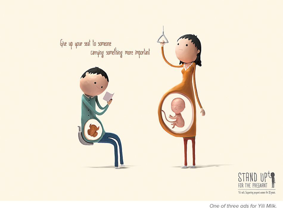
How do they use the campogo? Each poster illustrates two patrons of public transit hosting something inside of themselves and snuggly incorporates the tagline “Give up your seat to someone carrying something more important.” The campogo sits in the bottom corner of the three different campaign posters, illustrating a person standing, holding a subway or bus handle. The words “Stand up for the pregnant” are depicted in a childlike hand – friendly and quiet yet altogether intriguing.
Why it works: Although this campaign is minimal in materials, it uses the campogo to solidify The Ask. The campogo visually distills the mood and message of each illustration and the mission as a whole.
SXSW Eco
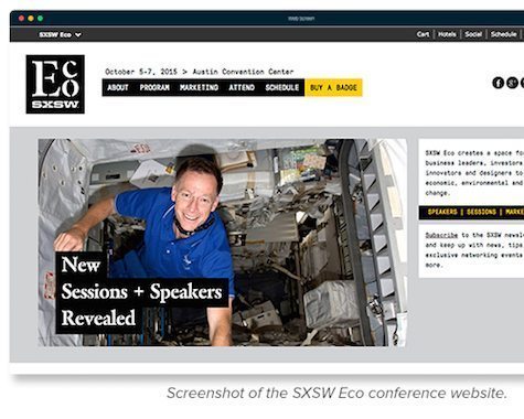 What is it? Most events use visuals cues to create an identity and increase visibility among potential attendees. SXSW Eco conference is a unique event within the larger SXSW mega-conference, and it distinguishes itself by using its own campogo.
How do they use the campogo? This campogo is brandished everywhere, including on the SXSW Eco website. It’s used as the event’s social media icon, displayed prominently on event signage, and placed apart from other visual icons like sponsor logos or the main SXSW logo.
Why it works: SXSW Eco takes visual references from environmental initiatives by utilizing large stenciled typography. This trope is as quintessential as the recycling symbol and utilized by everyone from the EPA to the City of Minneapolis. By creating an icon that feels familiar to those in the eco space, the campogo creates an identity for the event to distinguish it from the mega-conference and speak directly to its target audience.
When You Don’t Need a Campogo
While the campaigns described above rely on the strength of the campogo to convey their personality and message, there are plenty of campaigns that do perfectly well with out them. The World Wildlife Federation (WWF), for example, creates effective awareness campaigns using only its logo and a consistently serious yet playful tone.
You’ll also see most social-media-centric campaigns operating without a campogo. Because these campaigns rely on easy sharing, an image file is much too cumbersome. Instead, a hashtag assumes the campogo’s responsibility for unifying materials and often even functions as a tagline and a call to action.
If you’re looking for help sorting out your brand, logo, sub-brand/s and campogos, take a look at our branding packages. We offer a variety of services to help Purposeful brands communicate clearly with all the right visual cues 🙂

Have you seen EngenderHealth’s “WTFP?!” (Where’s the Family Planning) campaign? Simple but clever logo and great content.
Alaina —
Thanks for sharing! I think the WTFP?! campaign makes great use of a hashtag-as-campogo. When paired with the super-sharable video content,
it’s a powerful way to educate people about family planning.
— Alison